
Income-Housing Gap
Another Deceptive Chart... With a Kernal of Truth


This infographic chart from Visual Capitalist has a kernel of truth: the ratio of median home prices to median household income is higher than it has been in the past, at least, 40 years.
However, it is deceptive.
In my article last month, Distortion of History: Housing Affordability Is Not Worst Ever, I walked you through a slightly different version of this housing price to income chart… one that takes into account mortgage interest rates as well.
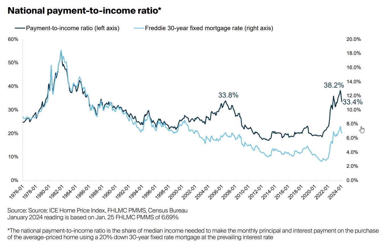
In my previous article I walked you through a series of charts showing the relationship of the payment on an average priced house going all the way back to 1976.
But instead of just plotting income versus home price—like the chart I started this article with—the chart from a month ago looks at what the monthly payment would be… so it accounts for mortgage interest rates as well.
And, it plots it as a percent of income needed to make the payment on a property.
Looking at it through that lens, we’re NOT at all time extremes of affordability. We’re high, but not nearly as extreme as the image above.
As real estate investors, we must…
